I recently set up an AI workflow to run conversion optimization on a set of B2B landing pages. The idea was to significantly compress the time it usually takes to analyze user sessions, draft recommendations, and apply them directly to the pages.
Below, I'll walk through the workflow itself, what the data showed, where the research-validation step pushed back on some of the recommendations before they shipped, and where my own judgment had to step in during iteration.
The whole thing ran end to end in one Claude Code session.
Tools used
- AI tooling
- Claude Code
- Clarity MCP
- Playwright MCP
- Parallel agents
- Analytics
- Microsoft Clarity
The workflow
The pages I was working on were four B2B landing pages, two languages, two regions. They were mostly discoverable through paid ads campaigns. The conversion goal was a booked discovery call through an embedded scheduling widget. The content was roughly the same across the four, but the copy and stats adapted for the language and the region.
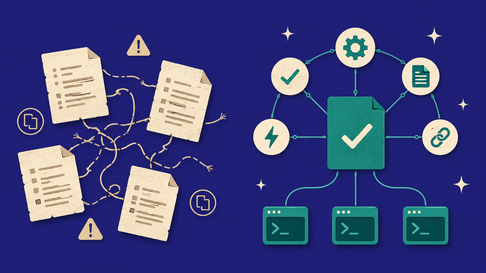
Normally, this kind of work looks like a few people taking turns. Someone pulls the analytics, someone else looks at the friction, someone drafts recommendations. The engineering team eventually implements them. It's not really any single step that's slow. It's the handoffs between them, and the days that go by where nothing happens because someone is busy with something else.
The AI workflow collapsed all of that into one continuous session.
The end-to-end agentic CRO workflow.
Two things made this possible: the Clarity MCP integration and the use of parallel agents.
The Clarity MCP was what handled the data side. Normally, working with Clarity means opening the dashboard, exporting CSVs, importing them into a spreadsheet, and writing things up by hand… Or opening user session recordings manually and taking notes. With the MCP, I could query Clarity from inside Claude Code. Session counts, scroll depth, click heatmaps, dead-click breakdowns, even individual recordings. Asking for any of it felt the same as asking Claude to read a file.
What is the Clarity MCP?
The Microsoft Clarity MCP is a server that exposes Clarity analytics through the Model Context Protocol. Claude Code calls it directly to pull session metrics, scroll depth, click data, and recordings, all without leaving the conversation.
The parallel agents showed up at two specific moments. Once the recommendations were drafted, I created five research agents, each one taking a different recommendation and cross-referencing it against UX and CRO literature. Once the validated recommendations were finalized, I used three more implementation agents to apply the same change set to the three remaining landing pages while I focused on the first one. Both of these were time multipliers a single-thread workflow couldn't match.
What the data revealed
Five days after the pages launched, I pulled the data and started looking for patterns. Across the four pages, 92% of the sessions came from mobile, which made the mobile experience the dominant signal, contrary to initial beliefs. Per-page metrics looked like this.
| Page | Sessions | Avg scroll depth | Avg duration | Dead clicks |
|---|---|---|---|---|
| Page A | 137 | 33% | 41s | 41 |
| Page B | 46 | 27% | 77s | 1 |
| Page C | 17 | 49% | 127s | 12 |
Page A was the only page with enough traffic to act on. The others had between 17 and 46 sessions, which was too thin. Even Page A's 137 sessions over five days is directional territory, not statistically conclusive. The patterns were consistent enough to be worth acting on, but anything that follows should be read as a signal, not a tested finding.
A few friction points came out of the data.
The most obvious one was the scroll depth. 52% of sessions never scrolled past 25% of the page. The page drew mostly paid traffic, which meant half the paid clicks were bouncing before they saw anything below the hero. Normally, this points to one of two things: a hero that's too dense on mobile, or campaigns that aren't matching user expectations.
Dead clicks came next. Page A had 41 of them in those five days. There were a few elements that misled users: hover zoom effects that made them look interactive without doing anything, comparison table rows that looked like links. These were textbook false-affordance design issues, but seeing them quantified in the session data made the priority clear.
The CTA data was also telling. The secondary CTA got a 16.5% click rate (26 clicks), while the main CTA got a 10.1% rate (16 clicks). The secondary CTA was outperforming the primary one. The reading was that users wanted education before commitment.
One smaller signal: the demo booking modal had a 5.7% close-click rate over those five days. Some users were opening the booking widget and closing it without scheduling.
Before acting on any of these patterns, I went into the Clarity dashboard to verify them by hand. The AI's findings had to hold up against the actual sessions, click maps, and recordings. Most did. The scroll-depth issue was visible in the recordings: users opening the page on mobile, glancing at the hero, and bouncing within seconds. The dead-click locations matched what the click heatmap showed. A few of the smaller patterns were less clear, so I down-weighted them.
One thing I missed on this run: the MCP exposes behavioral metadata per session (intent classification, rage clicks, dead clicks) but not Clarity's natural-language AI summaries. The right move would have been to filter by intent and behavior signals to pre-select sessions to watch, rather than just pulling the twenty longest. Lesson for the next run.
Scroll depth distribution on Page A over five days.
Pulling all that manually would have meant exporting several Clarity reports, normalizing them in a spreadsheet, and cross-referencing the session recordings separately. With the MCP, surfacing the patterns took a thirty-minute conversation. Verifying them in the dashboard afterwards added another half hour, but that was confirmation, not discovery.
Where the research overrode the recommendations
From the friction points, I drafted six recommendations:
- Reduce hero density on mobile
- Make dead-click elements interactive
- Change the CTA hierarchy
- Address the modal drop-off
- Tighten copy where users dropped off early
- Add an alternative contact path for users who closed the modal without booking
In a normal workflow, this is the point where the PM and designer would talk it through, maybe cross-reference a few articles, then send the recommendations to engineering. In this workflow, the recommendations went to the validation layer first.
I created five parallel research agents, each one assigned to validate one of the recommendations against UX and CRO literature. They pulled from CXL, NNGroup, Baymard Institute, FullStory, Unbounce, AB Tasty, and a few others. Each agent had the same brief: find the relevant studies, surface the strongest evidence either way, and come back with a verdict on whether to ship the recommendation, modify it, or kill it.
Most of the recommendations held up. Three didn't.
The most counterintuitive reversal was on the CTA hierarchy. The data had been clear: "See How It Works" was outperforming "Book a demo." The natural recommendation was to flip the priority and lead with "See How It Works." The research said don't. Tests on multi-CTA hero sections consistently show that adding a softer "Learn More" option can increase total clicks while dropping primary conversions by double-digit percentages. The soft CTA cannibalizes the primary action. The right move was to leave the hierarchy and reframe the primary CTA copy instead. Outcome-focused phrasing ("See it in action") tends to outperform commitment-focused phrasing ("Book a demo") in similar tests. I landed on "See it in action." The secondary CTA didn't disappear, just changed shape. Instead of a competing button, I made it a subtler scroll link ("Learn how it works" with an animated down arrow) pointing further down the page. That kept the education signal users wanted without the cannibalization risk.
Another reversal involved the alternative contact path inside the modal. The modal close-click signal looked like users were opening the modal and bailing because they wanted a different way to book the demo, so the natural move was to add an alternative contact link inside the modal. Research on single-CTA versus multi-CTA surfaces consistently shows single CTAs get materially more engagement in conversion-focused interfaces. The modal is a single-task surface, and adding a second action inside it creates choice paralysis at the moment of conversion. The right place for this was outside the modal, below the comparison table CTA row.
The third pushback was on the loading state for the modal. The first version had nothing visible while the embedded scheduling widget was loading, which felt broken. The natural fix was to add a skeleton screen. The research on skeleton-vs-spinner is genuinely split. Some studies find skeletons make loading feel up to 50% faster; a Viget study with 136 participants found the opposite, with skeletons performing worst on perceived duration. The modal here is a single full-page task surface, not a content list streaming in, which made the Viget conditions feel more relevant. I shipped a three-dot pulse spinner.
Dropped
Drafted from data
Flip CTA hierarchy
Shipped instead
After research
Reframe primary CTA copy
Dropped
Drafted from data
Add alt-contact inside modal
Shipped instead
After research
Place alt-contact outside, below the comparison-table CTA
Dropped
Drafted from data
Skeleton loading screen
Shipped instead
After research
Three-dot pulse spinner
Two of the three reversals could have actively hurt the conversion metric the workflow was trying to optimize. Cannibalizing the primary CTA and adding choice paralysis to the booking modal would both have shown up as lower conversion rates after ship. The skeleton-to-spinner change was lower stakes but in the same workflow pattern: a default UX choice that research argued against.
The reason the research step is load-bearing is that it's what prevents the rest of the workflow from being a faster version of the same intuition-driven system most growth teams already run. Without that checkpoint, you ship recommendations from data without checking them against the literature.
Why parallel agents matter here.
Running five validation agents in parallel rather than one sequential research pass means each recommendation gets full attention from a dedicated context, instead of being one item in a long list. The pass ends up being both faster and more rigorous than a single sequential review would be.
Where the workflow still needed judgment
The research layer catches things that have been studied. What it can't catch is what only shows up when the page is rendered in front of you. That's where my judgment had to step in.
I implemented the validated recommendations on the highest-traffic page first, then ran a live review before scaling to the other three pages. A handful of iterations came out of that review.
The first one was about a scroll link I'd added below the primary CTA, the "Learn how it works" from the CTA hierarchy reversal. On desktop it was invisible because it sat below the fold of the hero. Moving it inline with the CTA button fixed the visibility.
Then there was a CTA count problem. The comparison section had a standalone CTA above the comparison table, plus a CTA row at the bottom of the table, plus the sticky-header CTA. Three visible CTAs in one view. The research had supported the bottom-of-table placement specifically, so I removed the standalone CTA above.
The industry cards went through a few revisions before they worked. The first version had them scrolling users back up to "How it works" when clicked. That felt disorienting because the page was scrolling backwards. So I changed them to open the demo modal instead. But that was a broken promise: NNGroup has written that a link is a promise, and users clicking "Food Service" want to see what the product offers for that industry, not a booking widget. The version that ended up shipping was an expandable overlay pattern. Click an industry card, the gradient slides up to reveal the relevant tags, and a soft CTA appears below. No layout shift, works the same on desktop and mobile.
The navigation had a different problem. I had a sticky-header CTA and a sticky-footer CTA on mobile, both pushing the same conversion. Most sites pick one, not both. I hid the nav CTA on mobile and kept the sticky footer. But that left the nav header empty, which looked unfinished. I replaced it with a language toggle, which the Clarity click data had shown users were already searching for.
None of this came out of the research agents. It required someone reviewing the live page and asking whether the experience felt right. The three-CTA viewport problem only showed up when I scrolled the live page on my laptop. The "scrolling backwards feels wrong" instinct came from UX taste applied in context. These are the kinds of calls that don't get automated.
Once the first page was finalized, I created three parallel implementation agents to apply the same change set to the three remaining pages. Each agent received the finalized page as the reference and the per-page adaptations (language toggle direction, translated copy, region-specific stats) as variation rules. The three pages shipped in parallel.
Closing thoughts
A few things stand out coming out of this.
The usual bottleneck in conversion work was the handoffs, not the analysis or the implementation. The days that pile up between the people doing each step are what slow it down. When the workflow lives inside a single conversation with a model that can pull analytics, draft recommendations, run research, and implement code, those handoffs disappear. What had been a multi-week cycle came down to a few hours.
The validation layer is what makes the workflow trustworthy. Without the research step, a fast workflow is just a fast way to ship the wrong changes. Two of the three reversed recommendations would have actively hurt the conversion metric the workflow was trying to optimize. Building that checkpoint costs almost nothing, and not having it means shipping things that wouldn't survive scrutiny.
The agents don't replace product judgment. They handle the parts of the work that are mechanical, time-consuming, or research-heavy. The human stays in the loop for the live review, the taste calls, and the orchestration. That division of labor is what makes the workflow productive rather than reckless.
A couple of honest gaps. Conversion results aren't in yet; the changes shipped this week and the volume needed for a clean read will take time. And the qualitative side of the analysis was the weakest part of the workflow. Quantitative pattern extraction from session data is something AI handles well, but watching session recordings for hesitation or confusion is still mostly a human job, even with rich metadata to pre-filter on.
The shape of this work will keep changing as agents get more capable, and the specific workflow described here will likely be obsolete within a few cycles. But the underlying principle that conversion work runs better as a workflow with a validation layer than as a loose loop of meetings and intuitions will hold up. The teams that build their CRO work around agentic workflows with built-in validation will move faster than the ones still running the cycle by hand. You can follow more of what I'm building on the articles page or read about how I think on the about page.